Beauty24 – Branding Case Study
In a highly competitive beauty market, Beauty24 needed to stand out with a consistent and sophisticated brand identity. We were brought in to develop a comprehensive Brand Toolkit that would unify the brand’s visual and verbal language across all platforms and communication channels in Latin America.
What we did
Branding
Client
Beauty24
Description
In a highly competitive beauty market, Beauty24 needed to stand out with a consistent and sophisticated brand identity. We were brought in to develop a comprehensive Brand Toolkit that would unify the brand’s visual and verbal language across all platforms and communication channels in Latin America.
The project began with an in-depth research and diagnosis phase, analyzing both local and international competitors across digital platforms, retail environments, and social media. This helped identify the brand’s main challenge: a visual style that blended too easily with the rest of the segment.
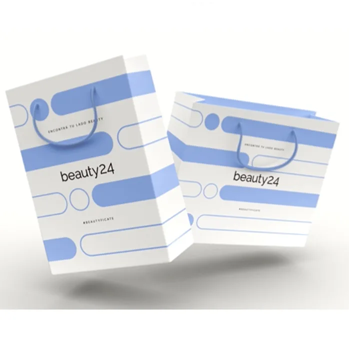
We then defined a unique tone of voice and positioning centered on authenticity, diversity, and personal expression. From there, we crafted the new brand claim — “Encontrá tu lado Beauty” — a powerful invitation for users to embrace and express their individuality.
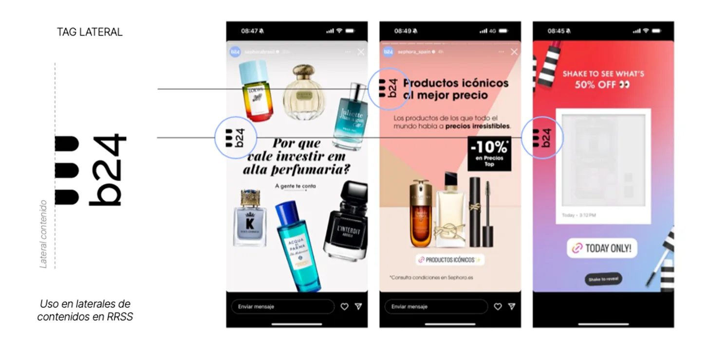
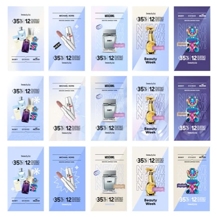
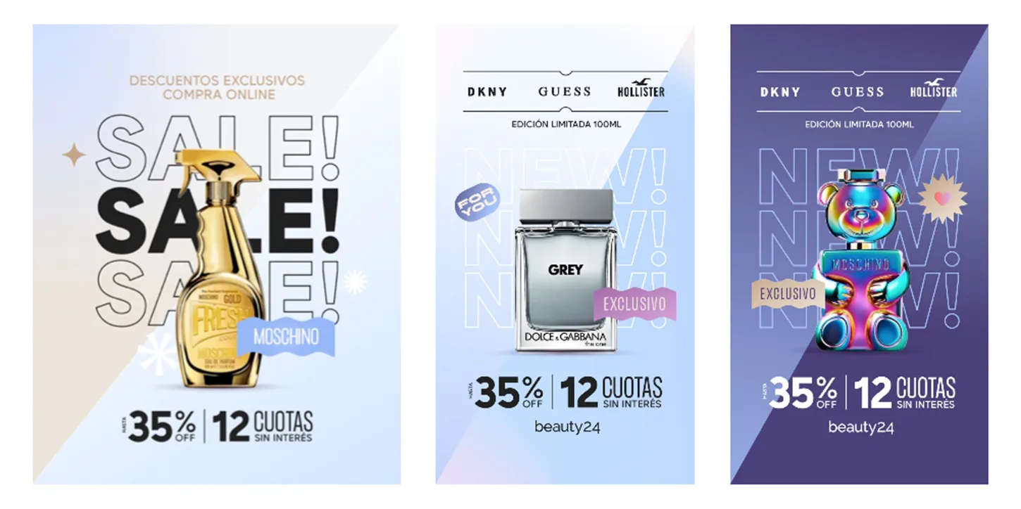
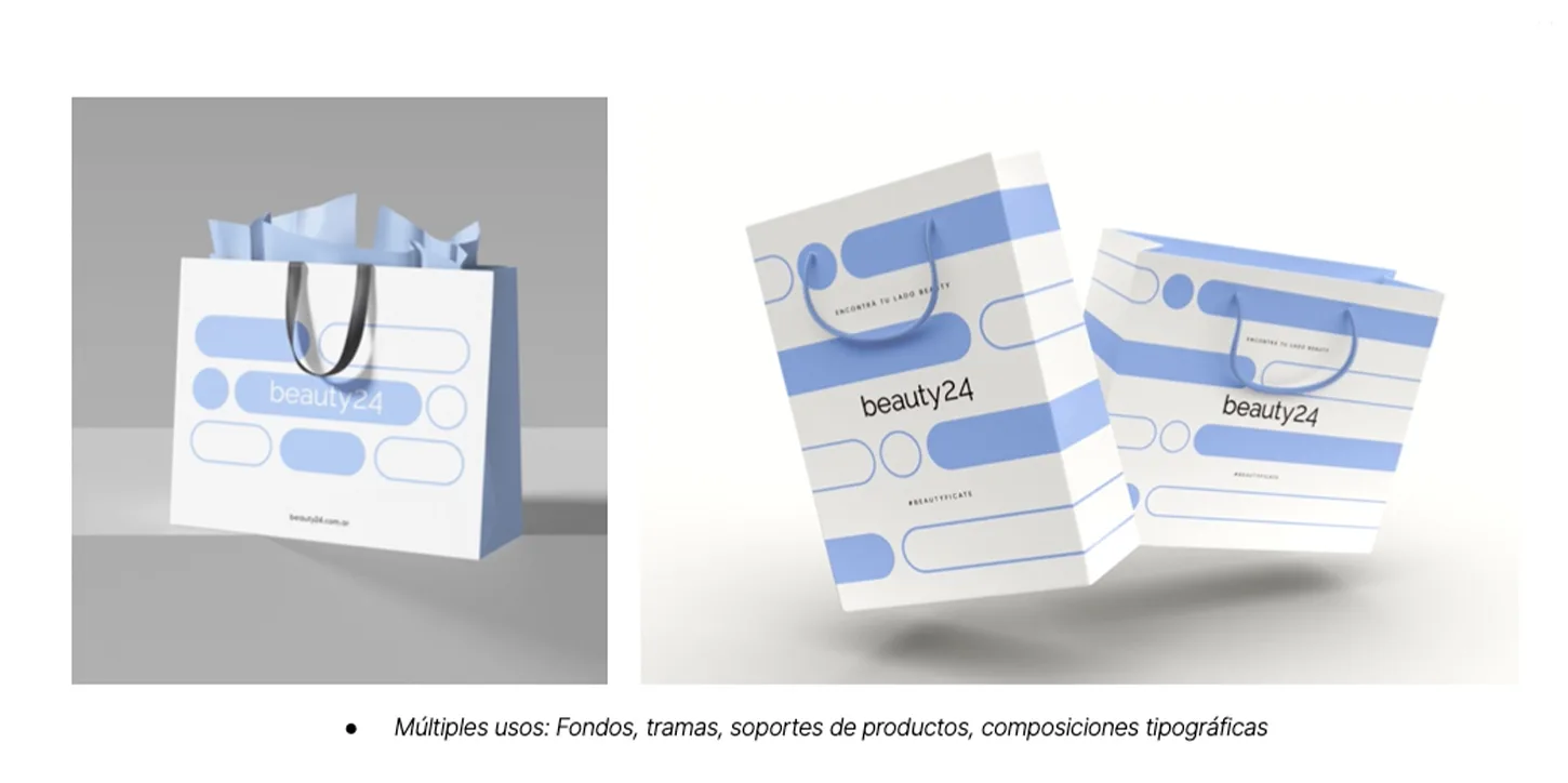
The visual identity evolved through a carefully selected color palette mixing classic pastels with vibrant, youthful hues. We paired serif and sans-serif typography to balance elegance with modernity, and developed textures, backgrounds, icons, and templates that enhance the emotional connection with the audience. A new graphic system using lines and dots provides brand presence even without the logo.
The final toolkit enables Beauty24 to execute, adapt, and scale communications in a visually coherent, emotionally resonant, and sophisticated way — helping the brand build recognition, trust, and connection throughout the region.


Despicable Me 4
Coca-Cola